Design System - AI
The devs were making UX decisions because design couldn't keep up. Six weeks later, the system answers them itself.
Context
Praxys has 14 digital products serving the pharmaceutical ecosystem. When I joined as an external collaborator, only 6 lived in Figma — messy, undocumented, uncomponentized. A design system existed, but it was legacy: tied to old technology, pending migration, and absent from the files where the team actually worked. In practice, real coverage across the stack was 4%. The development team ran several steps ahead of design, making UX decisions out of necessity.
The problem wasn’t visual consistency. It was that every design decision got resolved over chat, from memory, or directly by a developer rushing to ship. And none of those decisions were recorded anywhere.
Six weeks for two things in parallel: building Helix from scratch — an AI-first, cross-product design system that replaces the legacy instead of patching it — and redesigning the entire process. The goal wasn’t perfection, it was shipping fast with good judgment. A team that could build faster, with less friction between design and development, on a system built to be automated and scaled from day zero.
To pull that off in that timeframe, AI wasn’t an add-on. It was part of the stack from the start — on the design side and on the development side.
The starting point
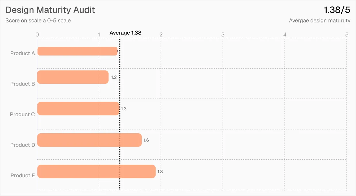
The first move was making the problem measurable. I built a design-to-development maturity scale and audited the 5 products with a Figma presence. Average: 1.38 out of 5. With that number on the table, there was something concrete to discuss and a real baseline to measure progress against.
The second move was understanding what existed before inventing anything. I used Claude in Chrome to audit the live apps and document the patterns that were already there but had never been formalized. Nine recurring patterns across products. That became Helix’s foundation.
Helix: an AI-first design system
The principle that governed every decision: “Helix defines how something works. Each product defines how it looks.”
With 14 products and completely different audiences — pharmacists, doctors, patients, distributors — unifying the aesthetics would erase the context that makes each product legible to its users. What they needed was shared structure: tokens, components, patterns, and handoff criteria that work the same way no matter which product you’re in. The target: Helix covering 80% of the product stack.
The lack of established processes wasn’t just a problem, it was an advantage. There were no habits to break, nobody to convince to change how they work. It was the exact right moment to introduce AI as part of the flow from day zero, not as an extra bolted on later.
What AI-first means here, concretely: all of Helix’s documentation lives in .md files — structured, versionable, and consumable by humans and machines alike. Token naming is slash-hierarchical and maps directly to CSS variables with no transformation. That’s not a minor technical detail: it’s what allows agents to audit, document, and answer questions about the system with no intermediate layer. If the naming is inconsistent or the documentation lives in Figma screenshots, AI tools break. If it’s well structured, the entire system becomes automatable.
The token architecture has three layers: primitives nobody consumes directly, semantics as the only layer components touch, and component tokens for specific cases. 350 tokens in total. Eight color scales in OKLCH, spacing on a 4px base, motion, radius, z-index.
On that foundation, the daily work ran as a loop between human and agent. A real cycle, with the button as the example: the agent audited the masters and detected inconsistent property casing across 247 variants. I validated the finding, defined the correct convention, and fixed it. The agent regenerated the component’s documentation with the new convention. By the time I moved to the next component, that convention was already part of the context, the agent applied it as an audit criterion automatically.
40+ components
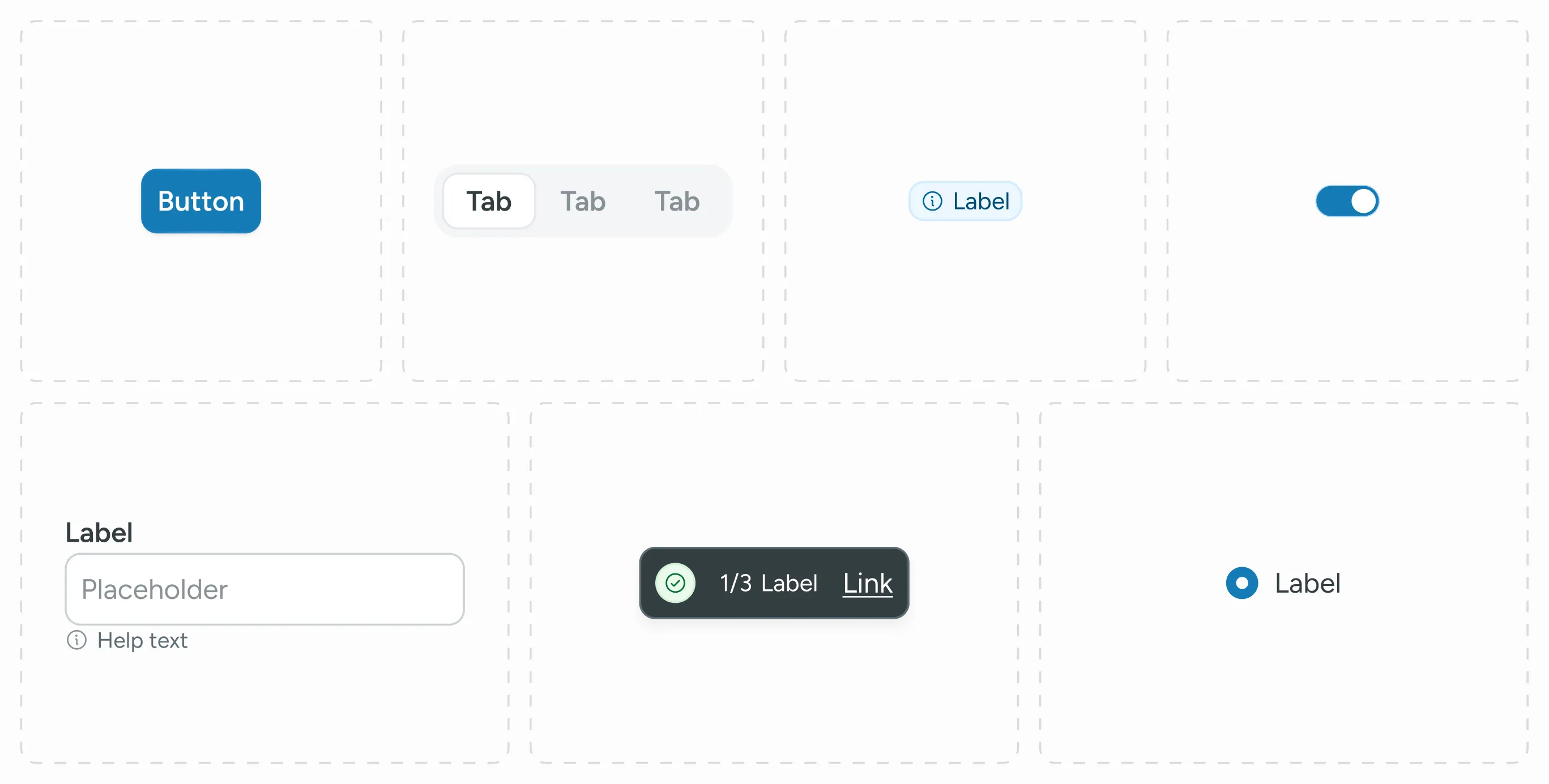
That loop is what made it possible to ship 40+ components in 6 weeks without losing consistency. It wasn’t speed at the cost of judgment — it was speed because the judgment was systematized.
The agent: turning a broken process into a system
The team already had a system for questions. It was just chaotic.
Everything lived in Figma, undocumented. Design decisions got resolved over chat, in meetings, from memory. Every time a developer needed to know how to implement something, they asked someone and that answer got lost. Next time, they asked again.
The mental model didn’t need changing. It needed to be turned into something that works.
I took all of Helix’s documentation — components, tokens, UX patterns, accessibility criteria, design decisions, roadmap — and put it into a Claude for Work project. The agent feeds on that documentation and answers questions in the same format the team was already used to: chat.
> how do I work with a modal?

To show a modal in Helix you use the helper function
showHelixModal(). Here's the full flow:

Basic structure

showHelixModal(
  context,
  title: 'Modal title',
  content: const Text('Body content.'),
);

With action buttons

showHelixModal(
  context,
  title: 'Confirm action',
  content: const Text('Are you sure you want to continue?'),
  primaryLabel: 'Confirm',
  onPrimary: () {
    _doAction();
    Navigator.of(context).pop();
  },
  secondaryLabel: 'Cancel',
  onSecondary: () => Navigator.of(context).pop(),
);

Most-used props

status         For semantics — destructive, warning, info
size           xs for simple confirmations, md/lg for forms
isDismissible  Set to false if you don't want overlay tap to close it
onClose Use it to show the ✕ close button> I need info on the date-picker component
The date-picker is currently in Backlog and not available
for use yet.
If you need it before it's ready, paste this in Teams:
⚠️ Helix question for Emilio
From: [your name]
Question: When will the date-picker be available and how
can I solve my case in the meantime?
Context: I need a date selector on my screen and the agent
says the component is in Backlog.
Urgency: [blocking / can wait]
#helix-dsAdoption is at an early stage and I’ll be honest about that: today, one developer on the team uses it. But looking at his query history, several were questions that used to come straight to me. He still comes to me for the more complex cases — and that’s fine, that’s what I’m here for. The point isn’t to replace the conversation: it’s that repetitive questions stop consuming everyone’s time, and every answer gets recorded instead of vanishing into a chat.
And then something happened that I didn’t design. The developer built a modal and, instead of asking me if it was right, sent the agent a screenshot: “what passes and what doesn’t?”. The agent audited it against Helix — and since the system also defines voice and tone, it didn’t just flag the structural issues: it suggested better copy for the modal’s text. Then the dev pasted in the code, and the analysis got even sharper.
> [screenshot of the dev's modal]
  what passes and what doesn't?

I can see the modal you built. A few important details
to review:

✅ What passes

· Clear, hierarchical title
· Buttons with destructive and link status
· Dismissible modal with opaque overlay
· Applies pattern HX-P01 (record deletion)

⚠️ What to fix

· onPrimary and onSecondary props are missing the ? —
  they should be nullable
· size=xs isn't in the size enum (xs/sm/md/lg). Use sm
  for this confirmation
· showsCloseButton isn't a real prop. To show the ✕
  use onClose instead

💡 Copy suggestion

The system defines voice and tone for irreversible actions:

Current:    "This action can't be undone"
Suggested:  "This change is permanent and can't be undone"

"Permanent" reinforces irreversibility better than "can't be
undone" alone — and keeps the DS's direct tone.And most importantly: the agent keeps itself up to date. As Helix grows, the audit agent generates the new documentation — I review and approve it. The consultation agent absorbs it. There’s no manual “update the docs” step. The system feeds itself.
Auditing with Claude Code + MCP
Once components started getting built, I needed a way to audit them at scale without manually reviewing 40+ masters.
I set up a workflow with Claude Code and the Figma MCP. The agent reads the component file page by page, detects inconsistencies in naming, token binding, and variant structure, and generates a report. I review, fix, and mark as resolved.
What it caught in a single session:
- 16 components with the typo terciary → tertiary
- Inconsistent property casing (Appearance → appearance) across 247 button masters
- Primitive tokens exposed directly in components instead of going through semantics
- A malformed token reference: token(‘color.text’) → color/text/primary
- Missing standard/md variant in text-area
- Typo in a token name: color/border/dafault → color/border/default
This isn’t work that requires creative judgment. It requires systematic attention — the kind of review a human does well once and then starts skipping. The agent does it completely every time, and produces a written record that stands as the system’s traceability.
Without this, those errors reach production. With it, you catch them before the developer implements them.
23 UX patterns for healthtech
A design system isn’t just components. It’s decisions made once so the team doesn’t have to remake them under pressure.
This was exactly our problem: developers ran ahead of the design team, making UX decisions out of necessity, not judgment. Not because they didn’t know better — but because nothing documented existed to guide them. The patterns exist to close that gap. When a developer hits a case that isn’t in Figma, they have an answer — and that answer is consistent with the rest of the system.
I documented 23 cross-product patterns specific to healthtech. Three that define the system’s judgment:
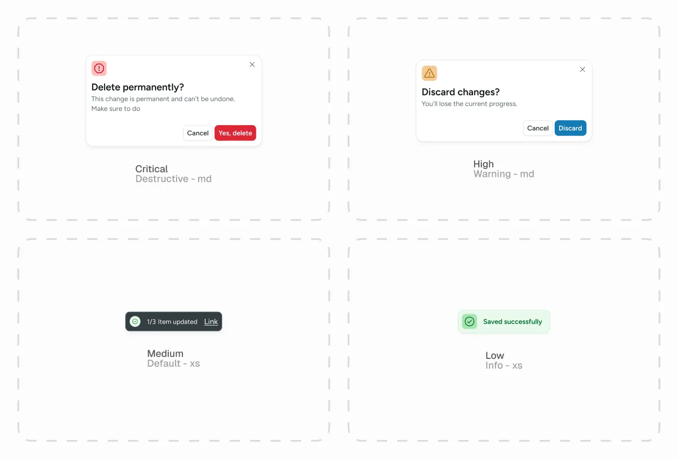
HX-P01 — Risk levels. Critical actions get a modal with re-confirmation. High risk gets a warning modal. Medium risk gets a snackbar with undo. Low risk gets a success toast. Not an aesthetic choice — a safety requirement.
These patterns are documented and maintained by the agent. When a new decision is made, it enters the system — not a Notion folder nobody opens.
Where it stands today
The numbers close the loop the diagnosis opened:
- Figma maturity: from 1.38 to 4.0 out of 5 in six weeks. What’s missing to go higher isn’t design — it’s implementation constraints like Code Connect, which depend on the tooling plan and are scoped for a next phase.
- The 6 products that lived in Figma, now adapted to Helix — plus 2 new products born directly on the system. (Of the 14 in the stack, those 6 were the ones with a Figma presence; Helix started there, with the goal of covering 80% of the stack.) The first real migration is underway: Conexión Plus, an existing product, and in parallel a new medication-traceability product being built on Helix from day zero. That contrast — migrating the old and being born on the system — is the acid test of any design system.
What's next
Six weeks aren’t enough to finish a design system. They’re enough to lay the foundations of one that grows on its own: it audits itself, documents itself, answers for itself — with a human making the judgment calls in every cycle.
The next step is for Helix to stop being a reference and become a tool: its .md files feeding interface generation directly. Prototyping from the system, not against it. Finding the experience differential at the start of the process — not at the end.
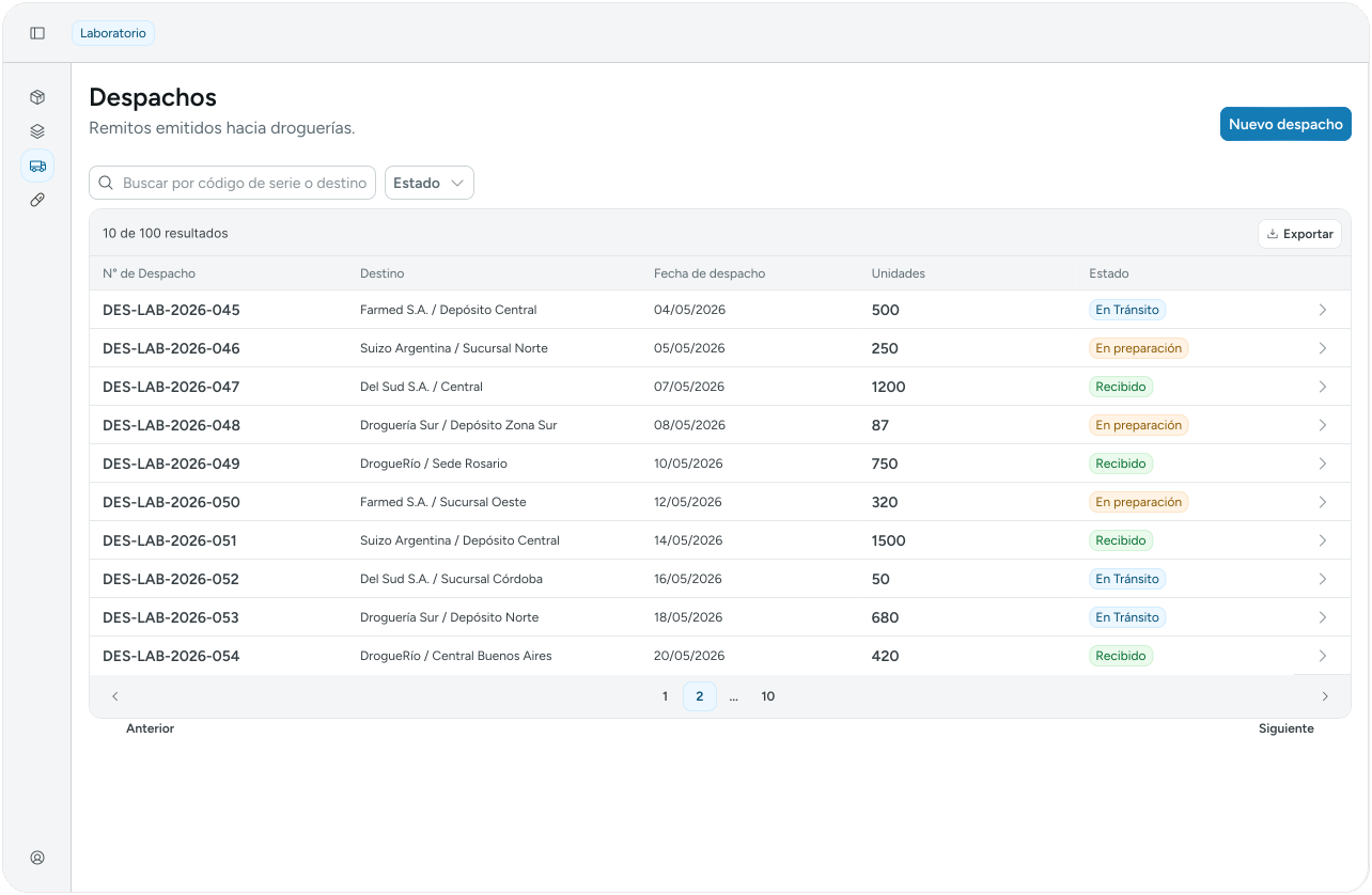
The system, alive. Helix running in one of Praxys’ products.