AI - Product
Adapt
An AI product, four operating systems. The judgment wasn't in what we added — it was in what we refused to add.
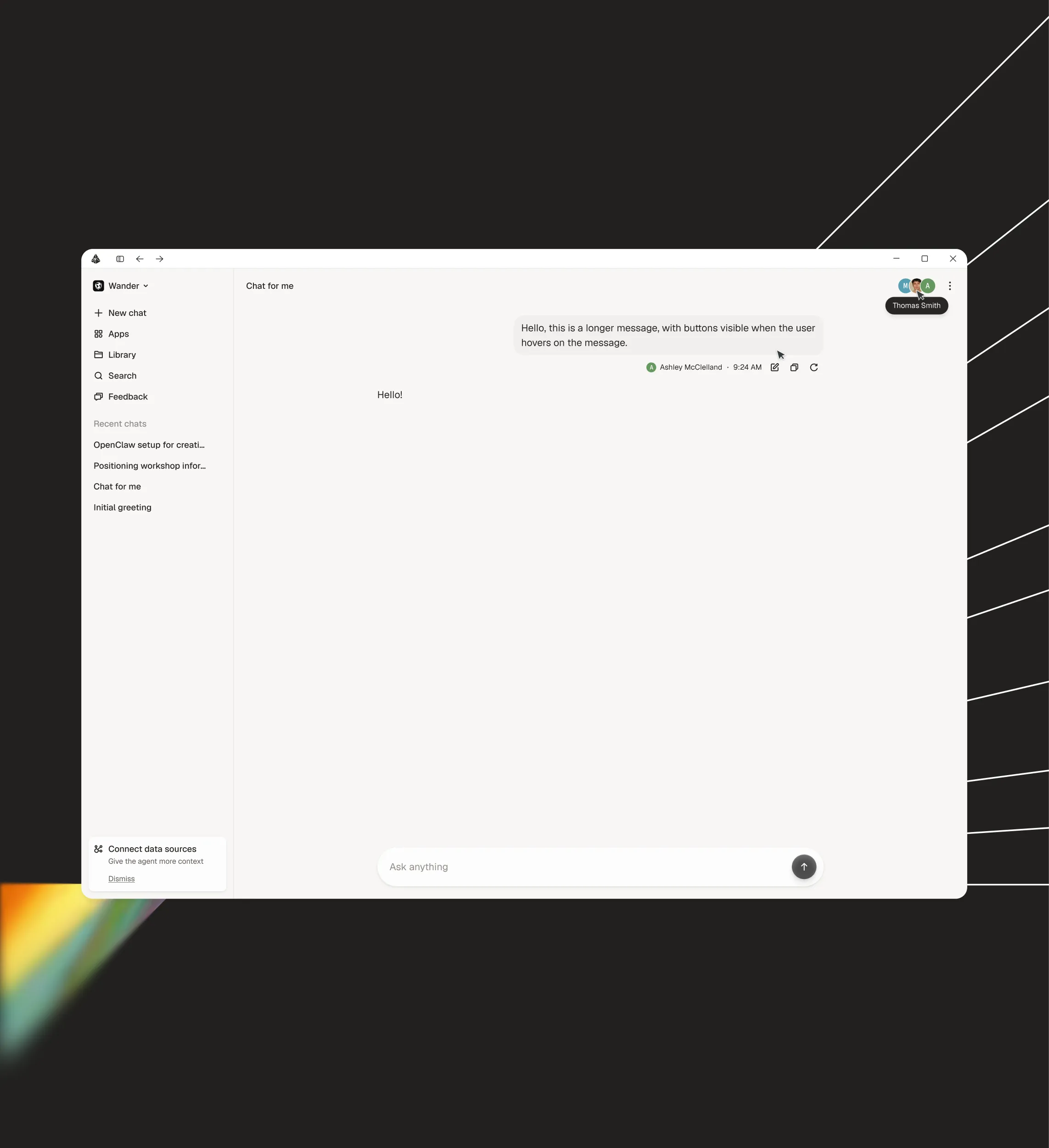
Adapt is a universal AI agent for work: it connects to a company's stack and lets teams ask questions, automate workflows, and build internal apps without writing code. When I joined, the brand and web were resolved. The native apps —iOS, Android, macOS, Windows— didn't exist yet.
That was the starting point: the visual system was already defined in a solid brand manual. Flat. Minimal. No playing with heights or layers. And the client had a clear obsession: pixel perfect. Every detail was going to be scrutinized.
- Year
- 2026
- Industry
- AI / SaaS
- Client
- Adapt
- Role
- Product Designer
Contribution
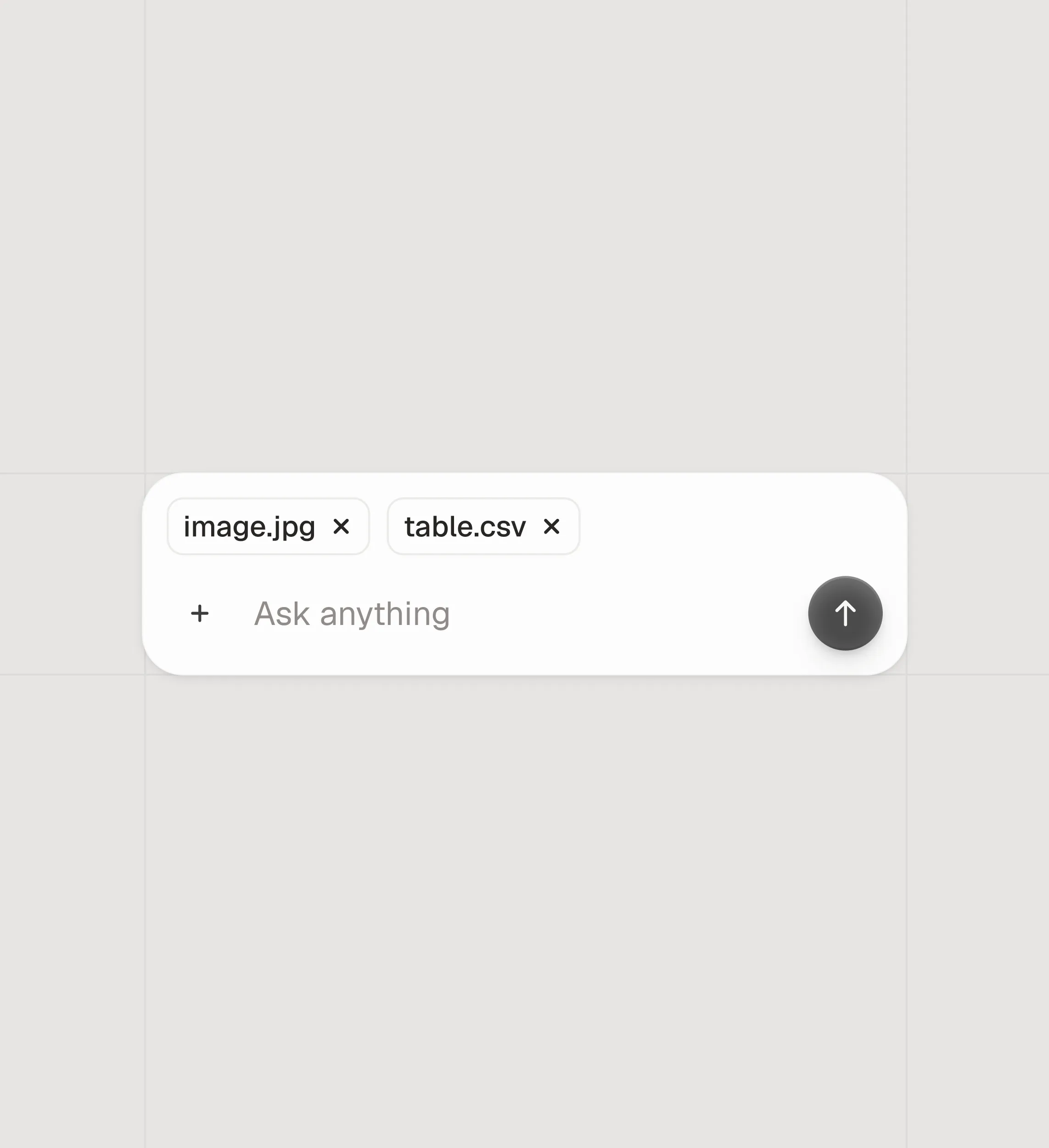
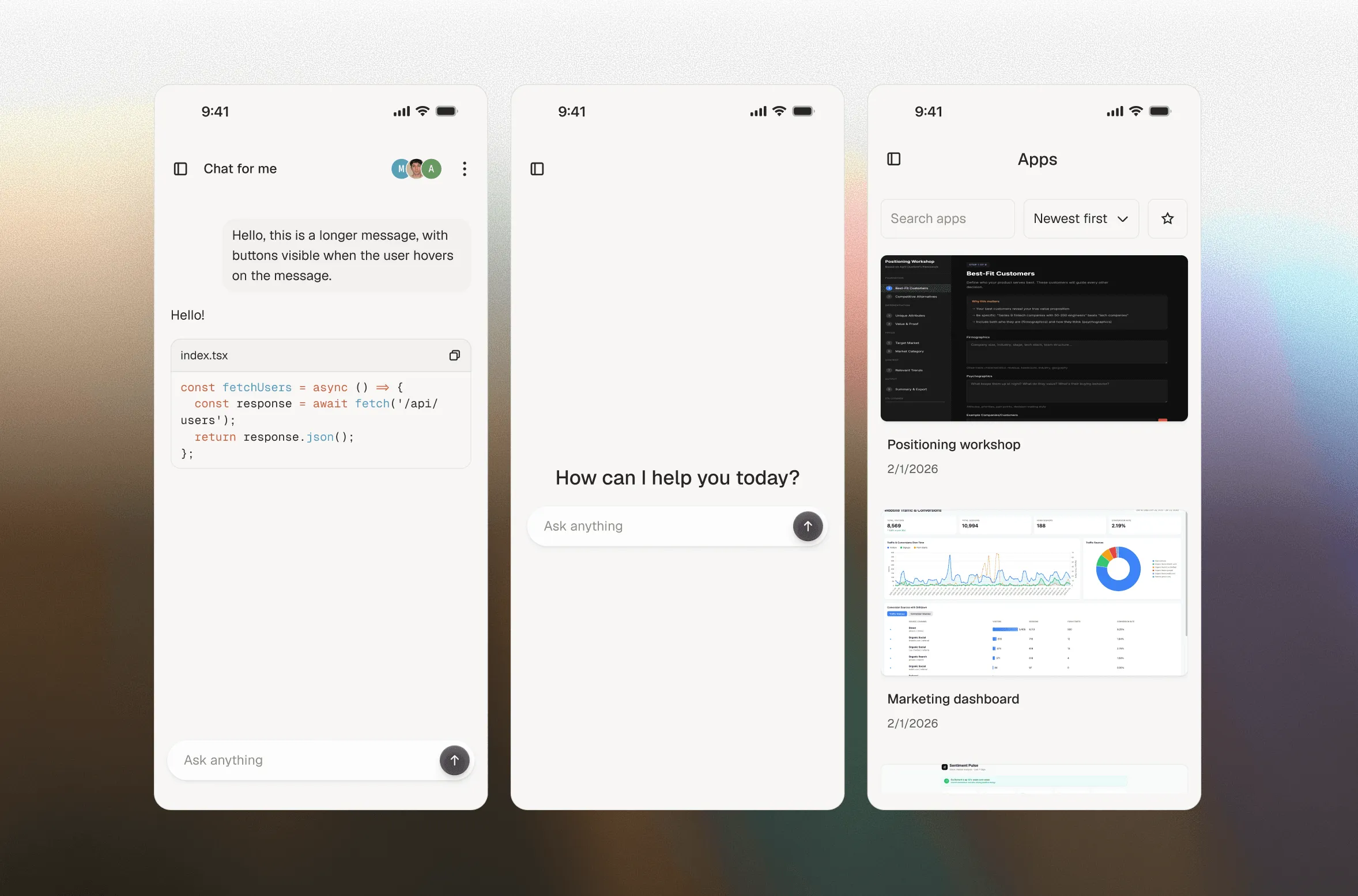
I extended that system so it could hold four native platforms. I built the component library that later fed the new screens and designed the flows that make the product run: onboarding, conversation, image upload, navigation between apps.
I came in when everything was still to be resolved. Nobody had translated the system into the native world yet.
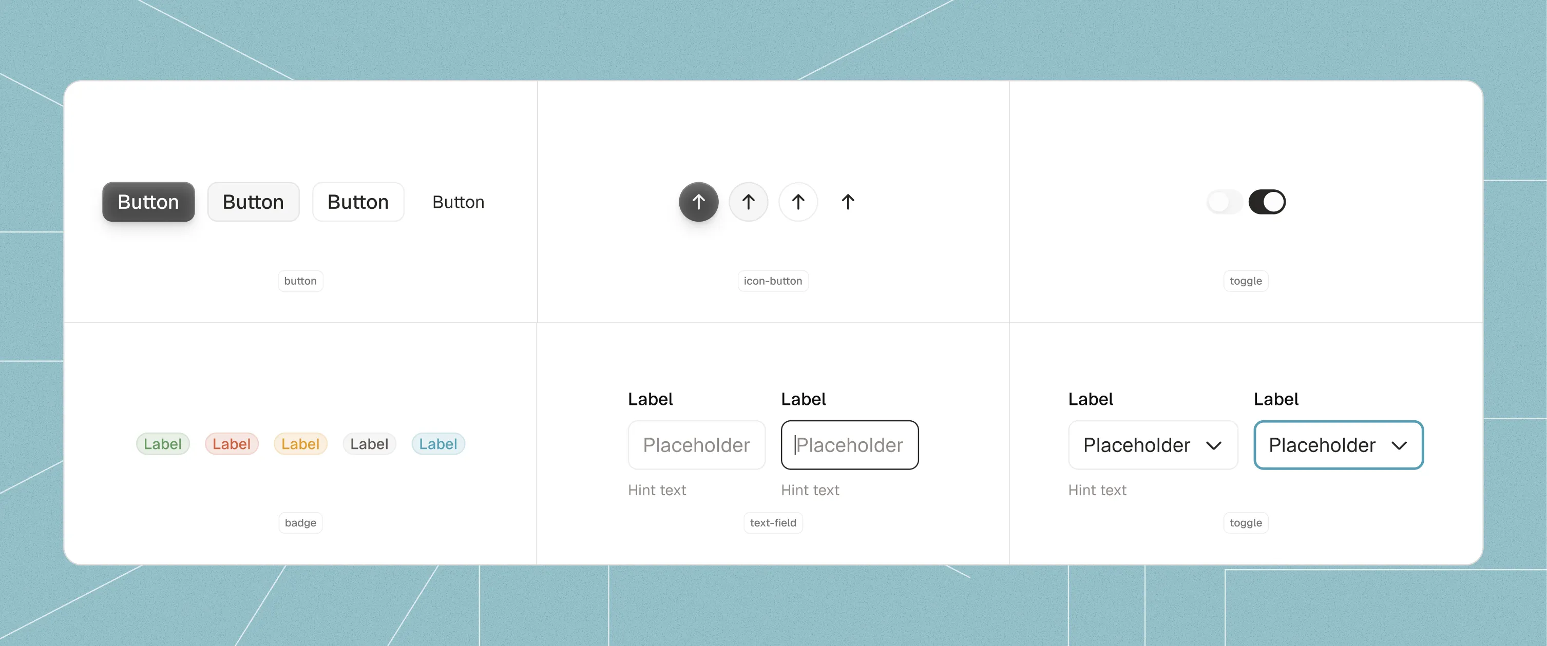
Component library
The full library was built on top of the existing brand system. Every component typed and variantized to work identically across the four platforms — no materials, no elevation, no platform-exclusive patterns.
Critical moment
Four operating systems each pulling in their own direction. iOS pushes you toward liquid glass, translucent materials, elevation. Android wants Material. macOS and Windows have their own rules. And the brand said something else: flat, minimal, no layers.
Giving in to native conventions broke the brand. Giving in to the brand risked making each platform feel off.
The decision was to give in to none. One hybrid system for all of them. No liquid glass, no materials, no hierarchy through elevation. Everything resolved with color, typography and spacing. If the brand said flat, it was flat on all four. Period.
That was the decision that ordered everything else.
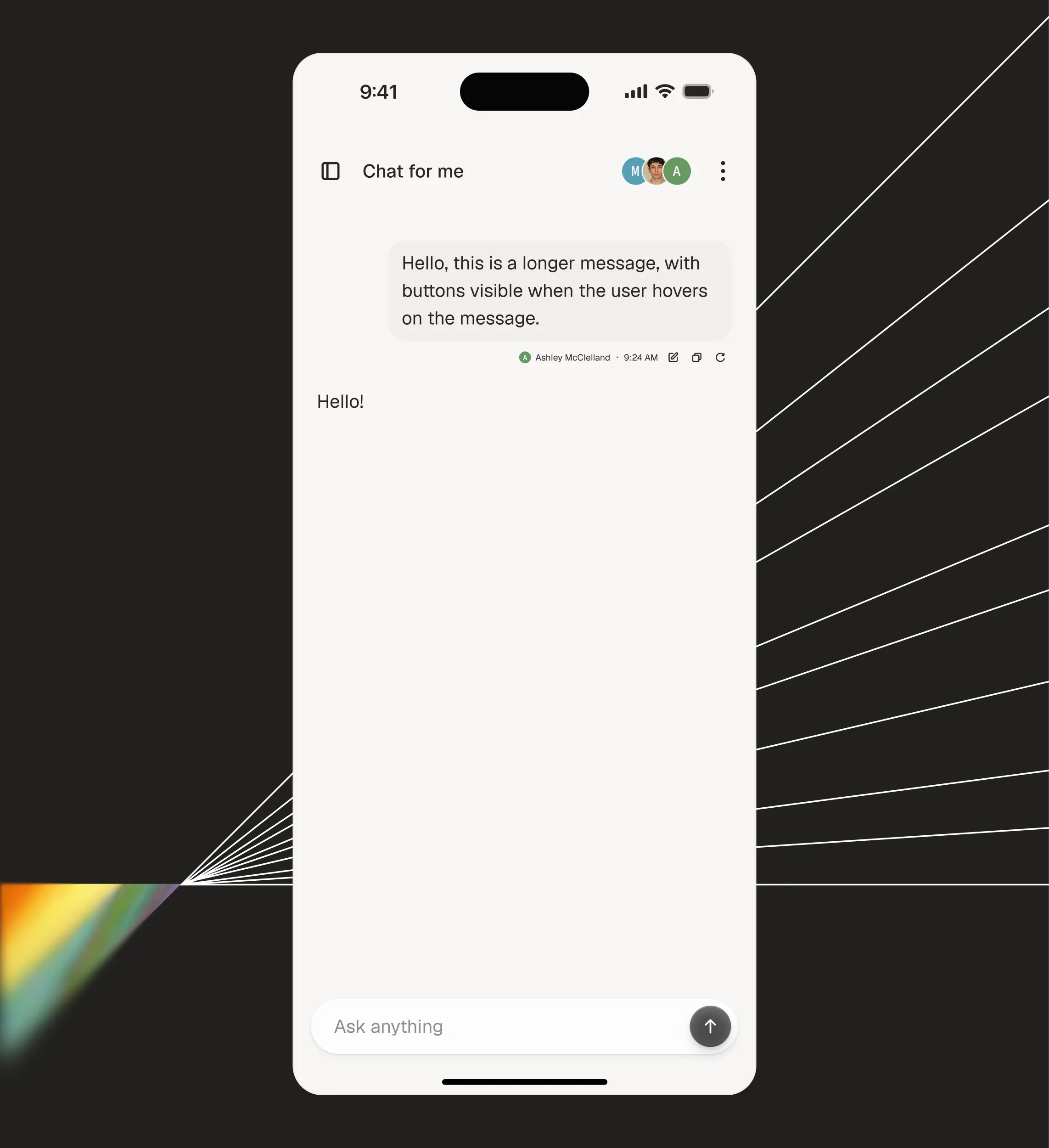
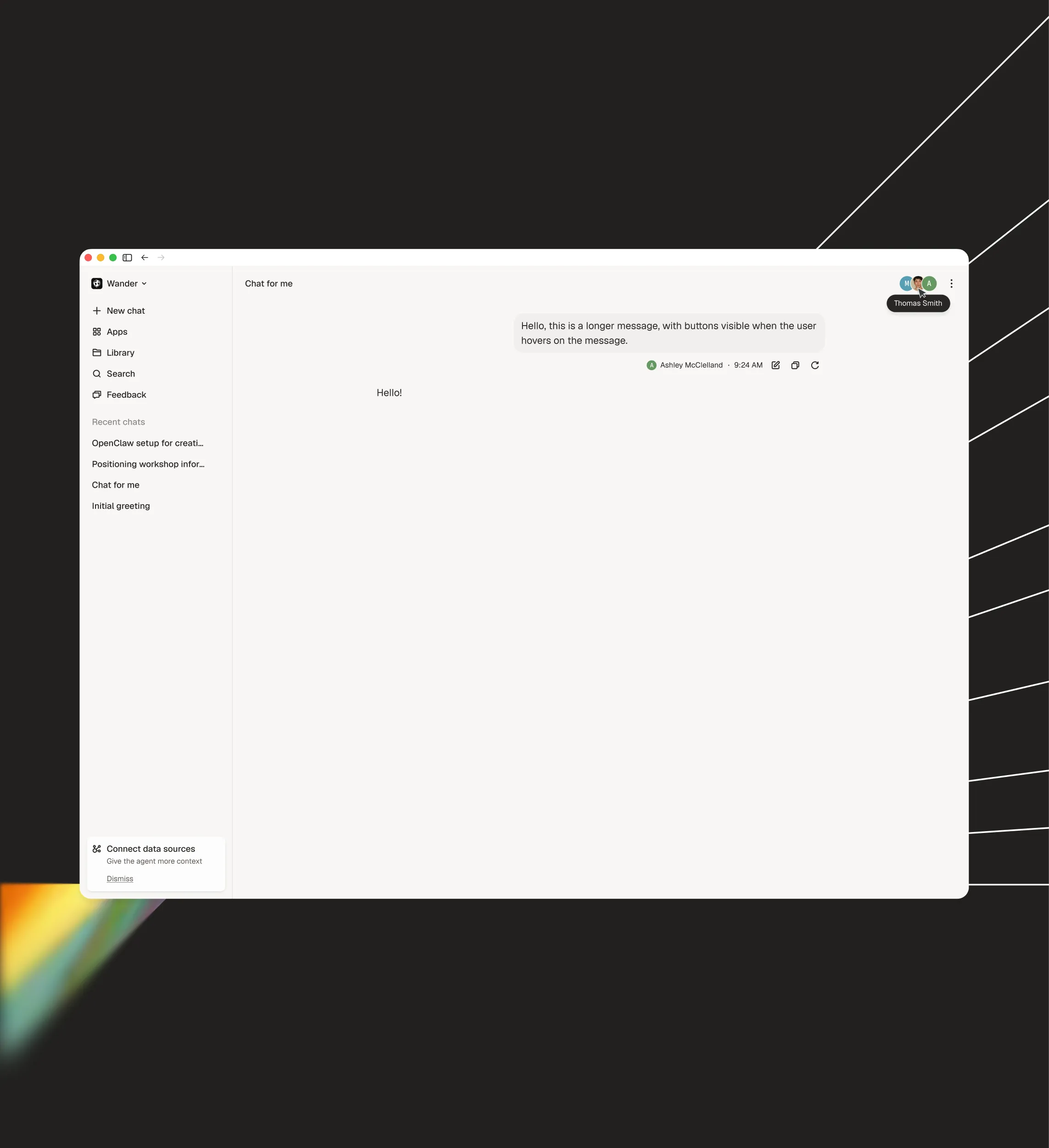
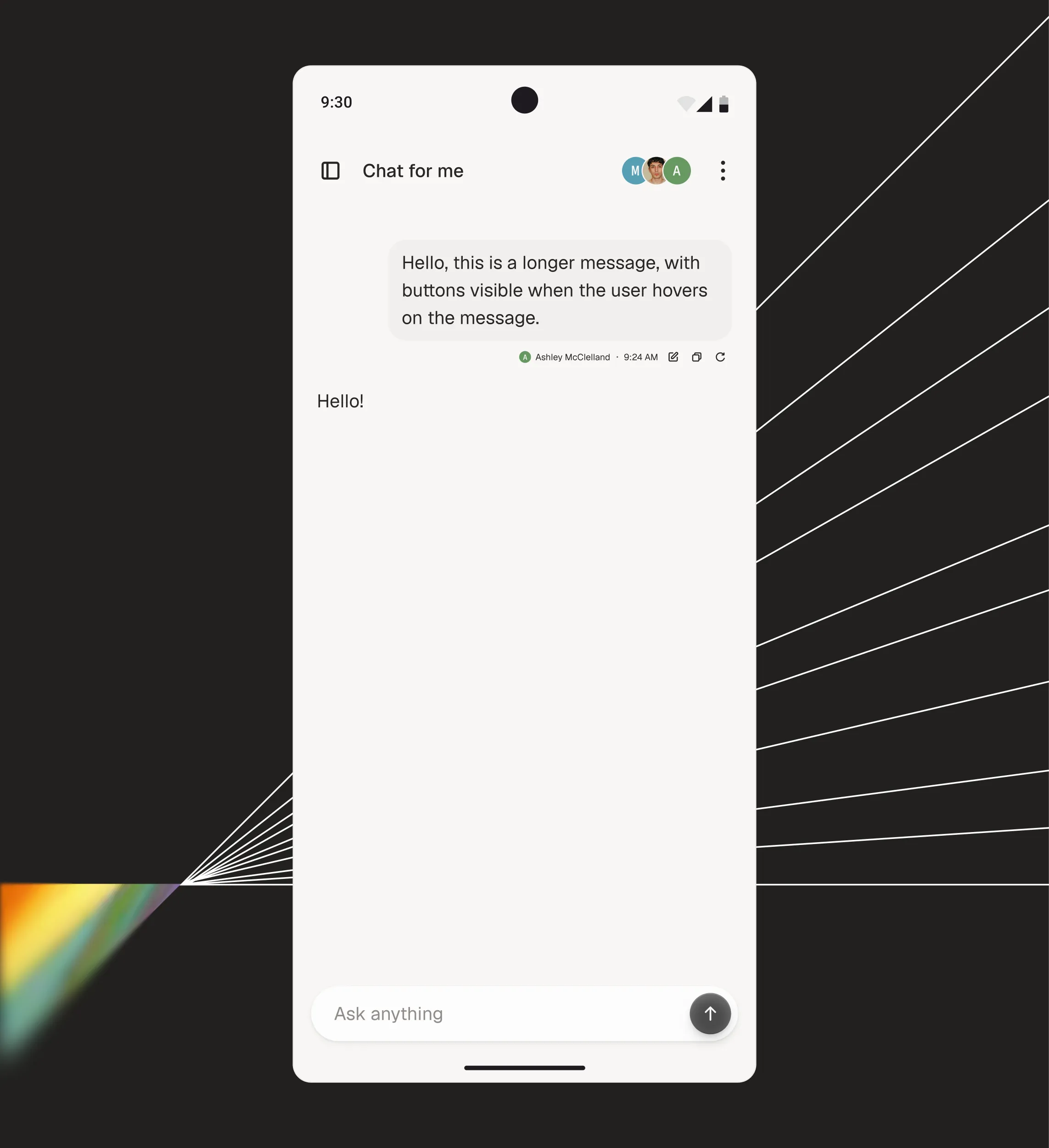
Process details
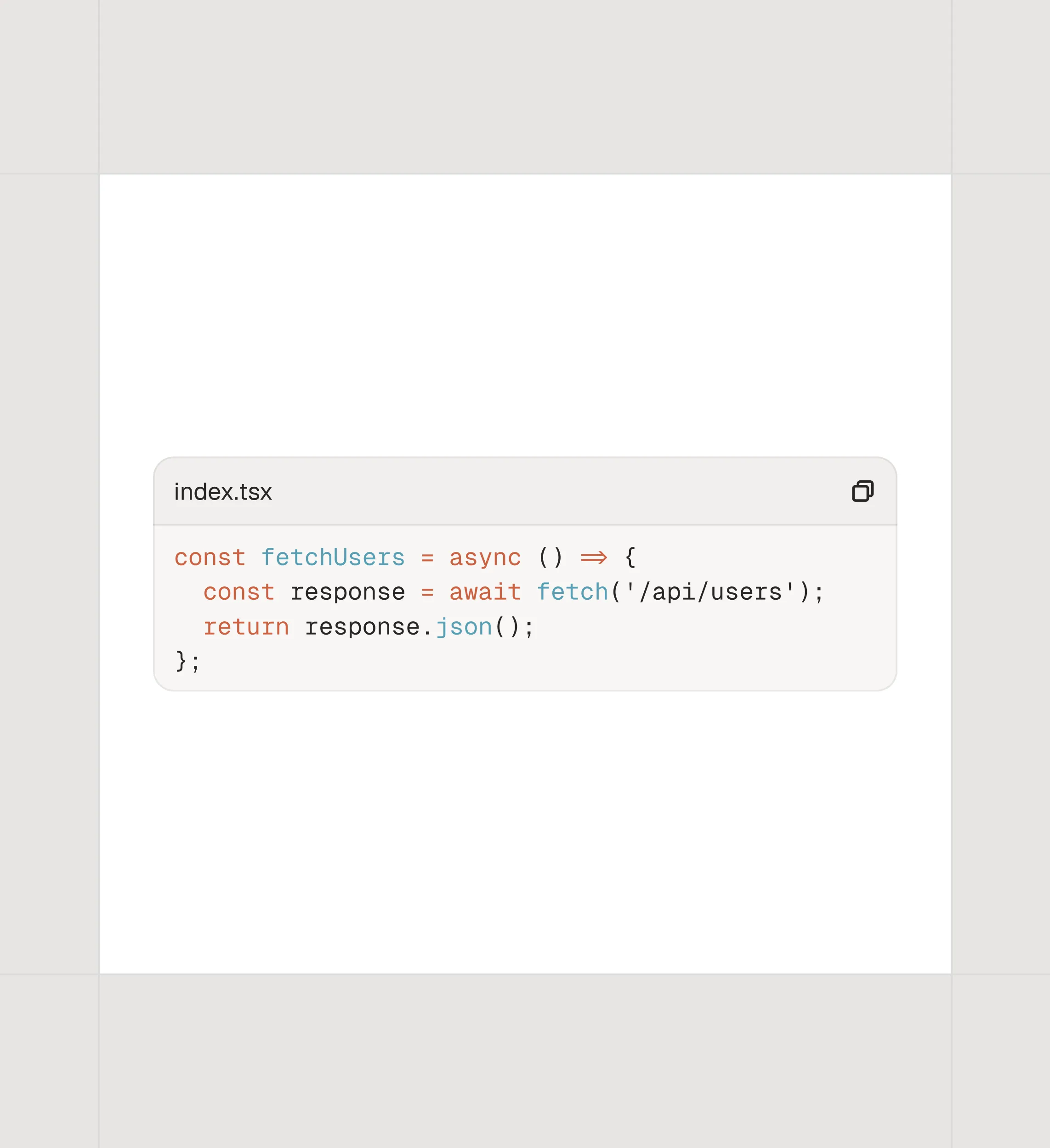
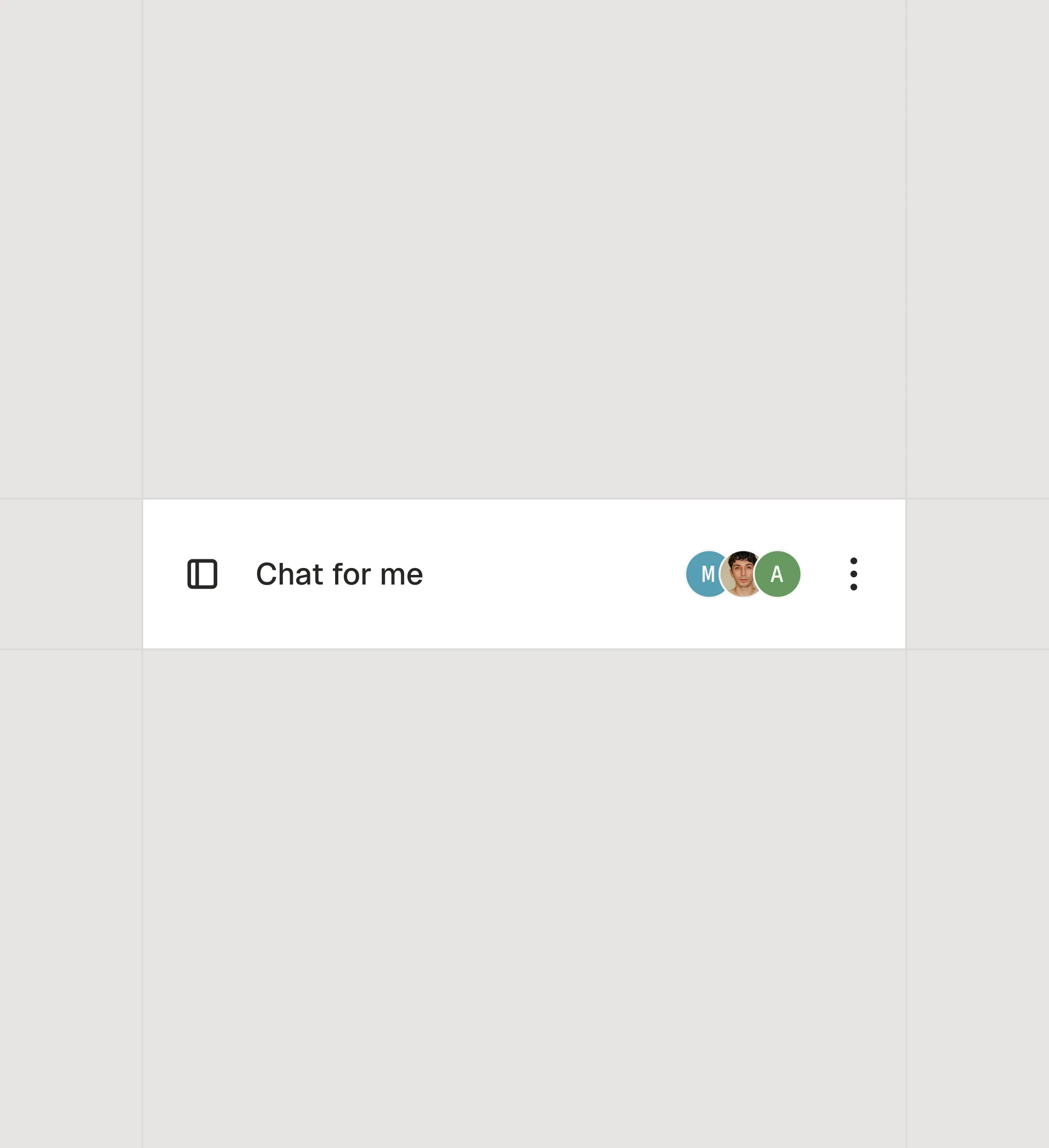
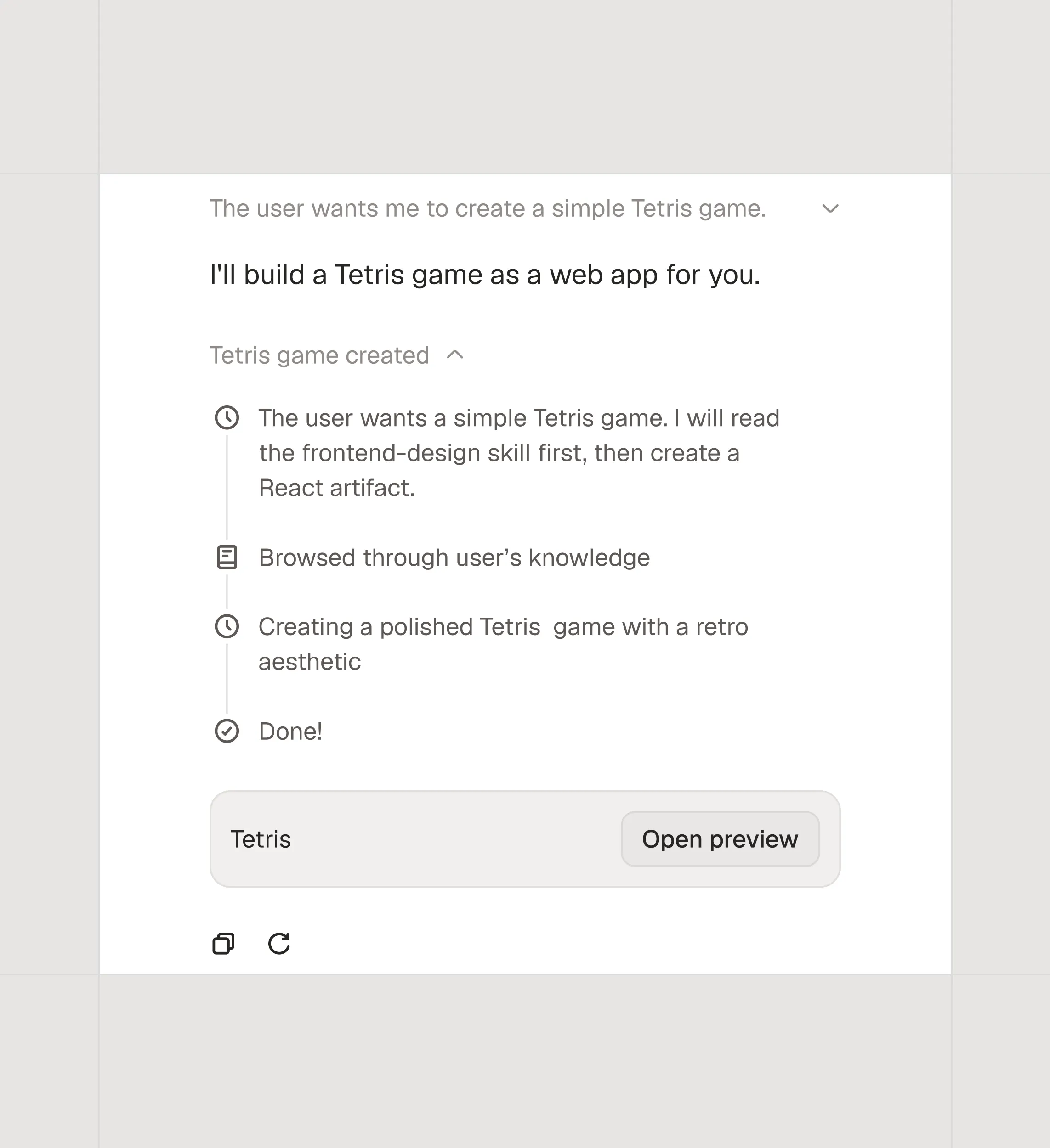
The chat carries a lot: code, files, multiple users. Every one of those elements could have broken the system by following the native pattern. None of them did. Four decisions that made the system hold.
Outcome
The design system was extended and adopted. Core flows shipped. Adapt is live — used by teams at Wander, DoNotPay, RevSend, and others.
But what stayed with me from the project wasn't the outcome. Every platform pushes you to look like it. The work, when the brand has its difference clear, is not to give in. To make the product feel like Adapt before it feels like the environment it lives in.
More project's