Product - IoT
Bluetek Cloud
37 out of 45 sensors were named "bluetek_sensor." That was the product's real problem — and where the redesign started.
Bluetek Cloud is a B2B SaaS platform that monitors HVAC systems across commercial and industrial facilities: warehouses, malls, clinics. IoT sensors distributed throughout buildings, measuring temperature, humidity, presence. Data that later informs decisions about energy efficiency.
Two very different users depend on the platform. A field technician checking sensors on their phone while walking through a warehouse. A supervisor tracking efficiency KPIs from a laptop. Same product, two ways of using it.
Bluetek had never had a designer on the team. They contacted me through Coderslab to come in as a consultant.
- Year
- 2026
- Industry
- IoT / SaaS
- Client
- Bluetek
- Role
- Product Designer
My role
The initial ask was UI. "We need the interface to look better."
When I started using the product, I realized it wasn't a visual design problem — it was the gap between what the product could do and what it made clear. I went back to the team and proposed we change the scope: full redesign, design system, product consulting. I was the first designer entering the company.
The critical moment
I started by using the product as a first-time user. Ten problems appeared immediately: sensor naming, raw JSON values, KPIs without comparison points, navigation without breadcrumbs in three levels deep. These weren't hypotheses — they were documented findings.
In parallel, I looked at how mature platforms solved the same problems to understand which conventions were already solved and what users in this industry expected.
The first thing I delivered wasn't a screen. It was the diagnosis: the ten problems ranked by impact and effort, with references to tools that had solved each one, and a proposed work order.
Define before designing. Every redesign decision that came after had evidence behind it, not a guess.
Process details
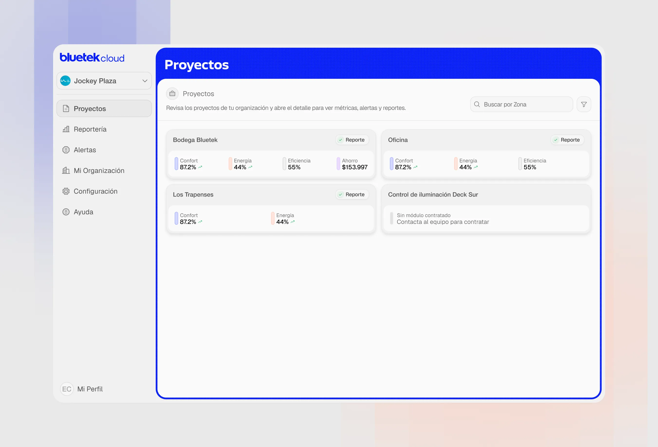
Before redesigning a single screen, I audited the live product and turned "the UX feels off" into a prioritized impact/effort matrix — 10 findings ranked from critical to low, each mapped to its fix.
Then I benchmarked against the tools that solved these problems at scale: Datadog, Grafana, ThingsBoard, PagerDuty. Every design decision in the redesign traces back to evidence — fixed icon sidebar, full breadcrumbs, sensor values with units and semantic states, KPIs with comparative deltas. Mobile-first throughout, because the most critical user is standing in a warehouse, not sitting at a desk.
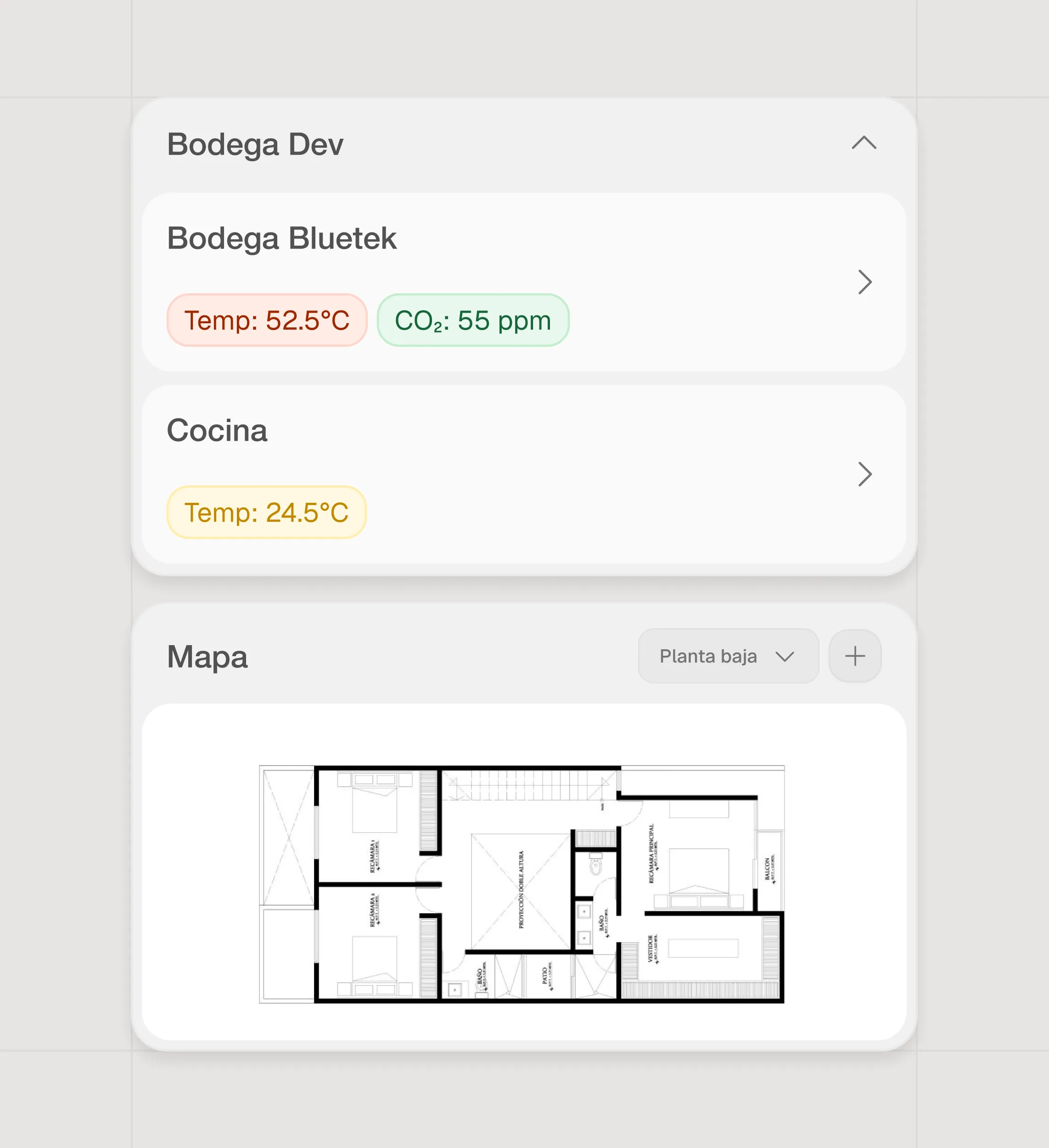
Design system
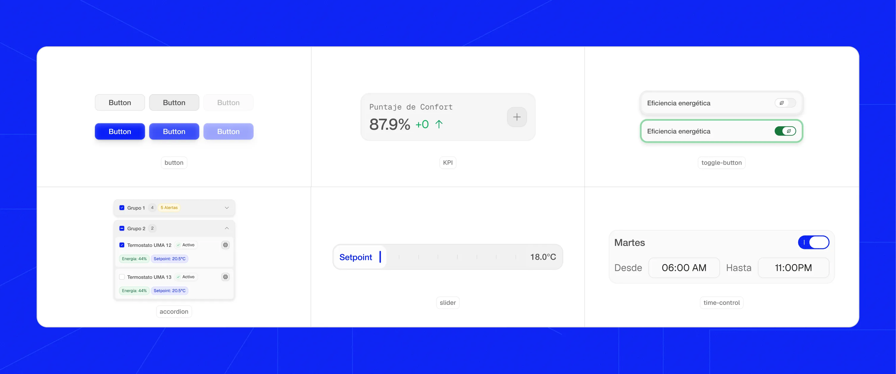
Component library & implementation
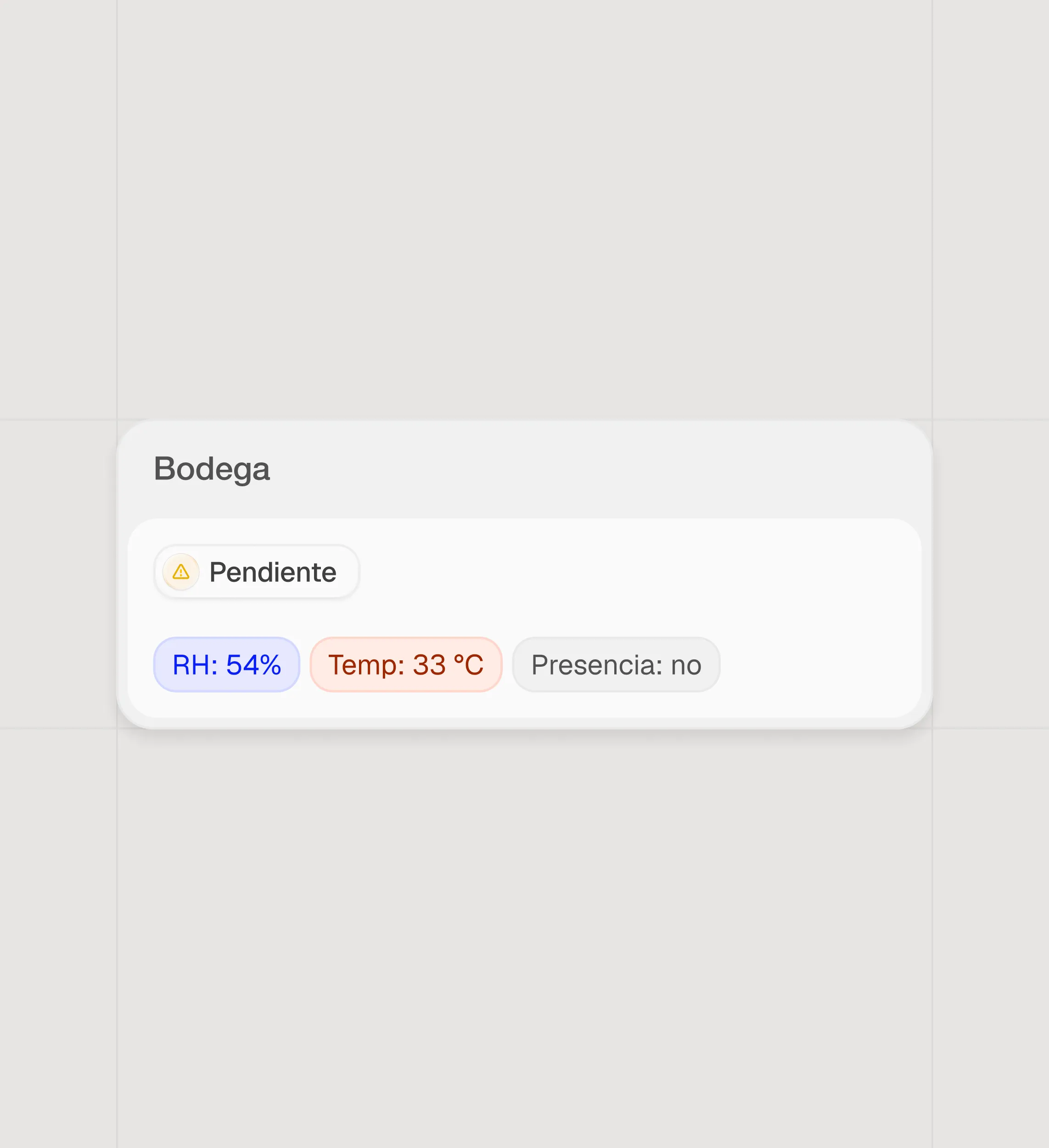
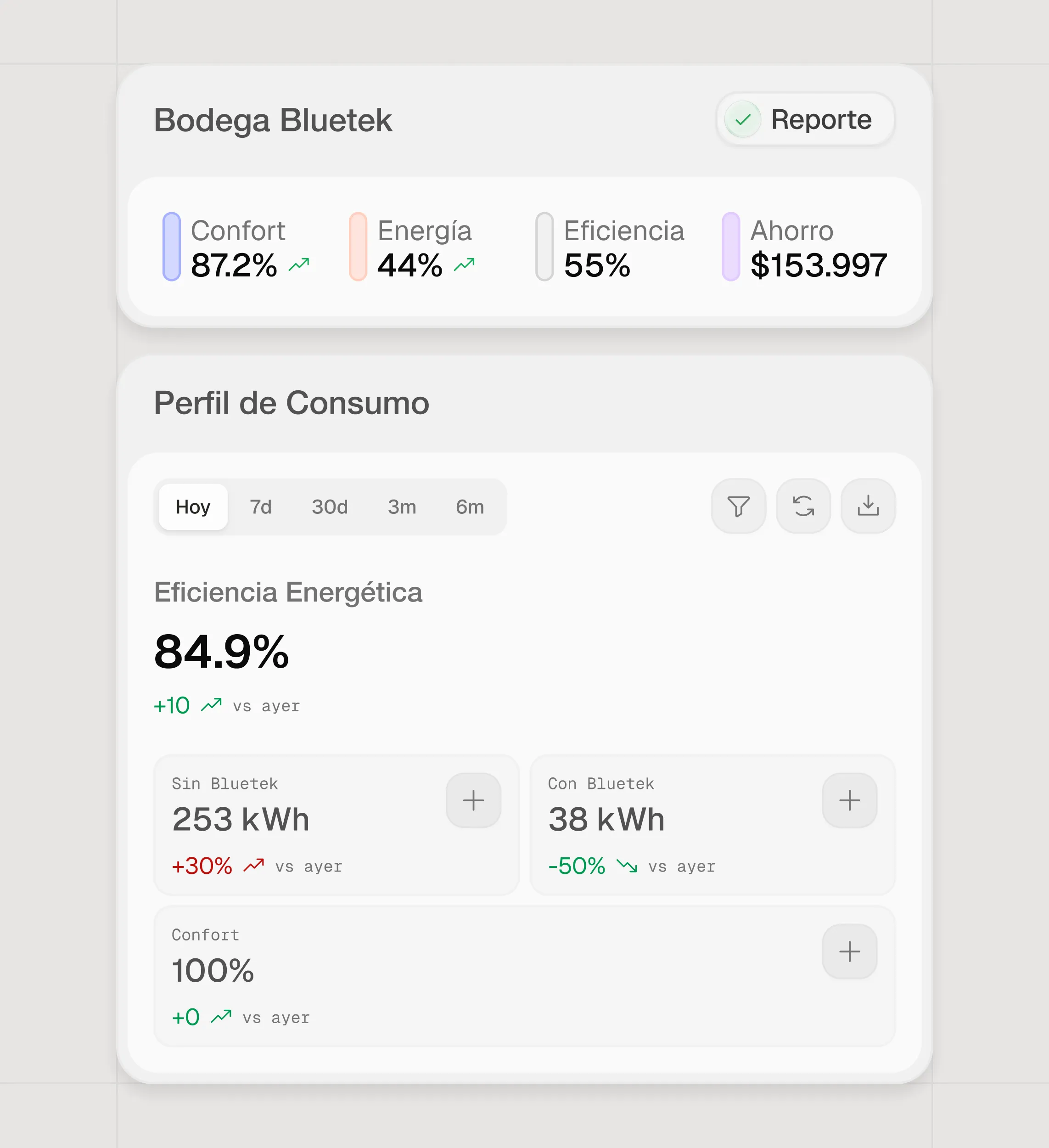
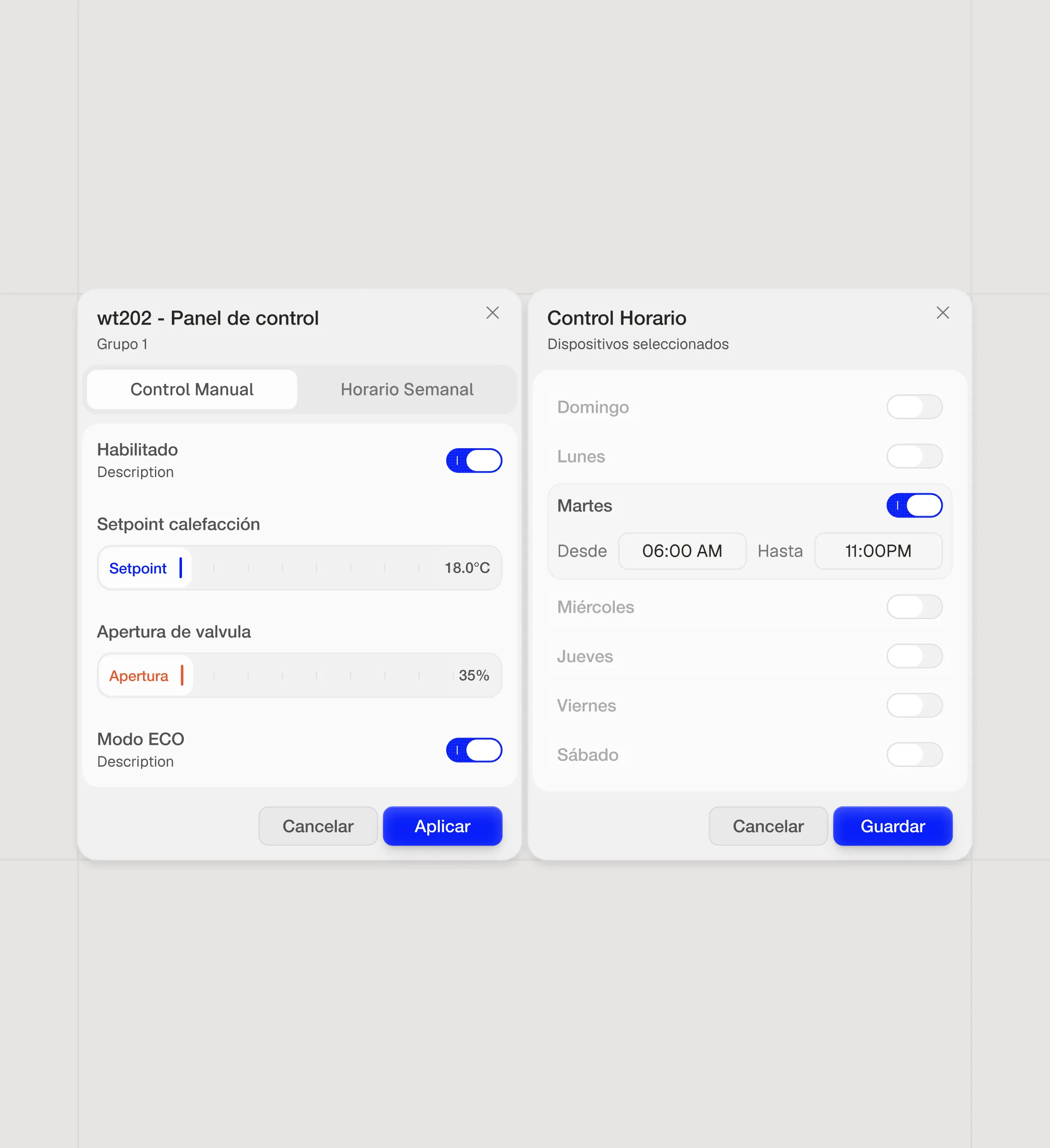
The component library grew to support all the decisions above. Improved inputs, toggles with feedback, KPI cards with deltas, sensor lists with semantic naming, zone navigation. Each component typed and variantized.
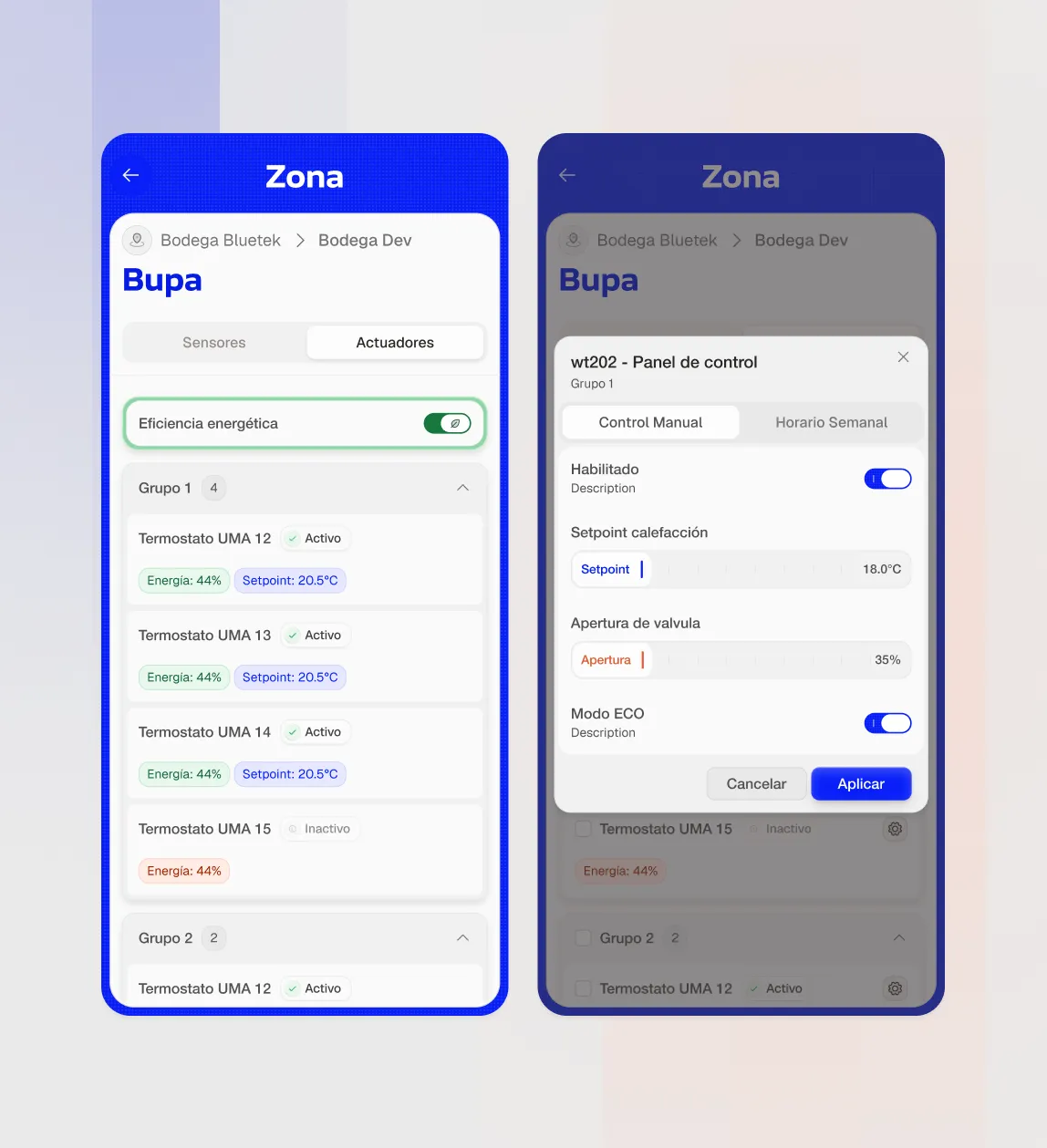
Field technician experience
Technicians operate from their phone while walking through the warehouse. The redesign prioritized this workflow: direct controls, clear navigation, actionable data on a small screen. Every decision above — naming, KPIs, controls, zones — converged here. Mobile-first meant clarity forced the design, not the other way around.
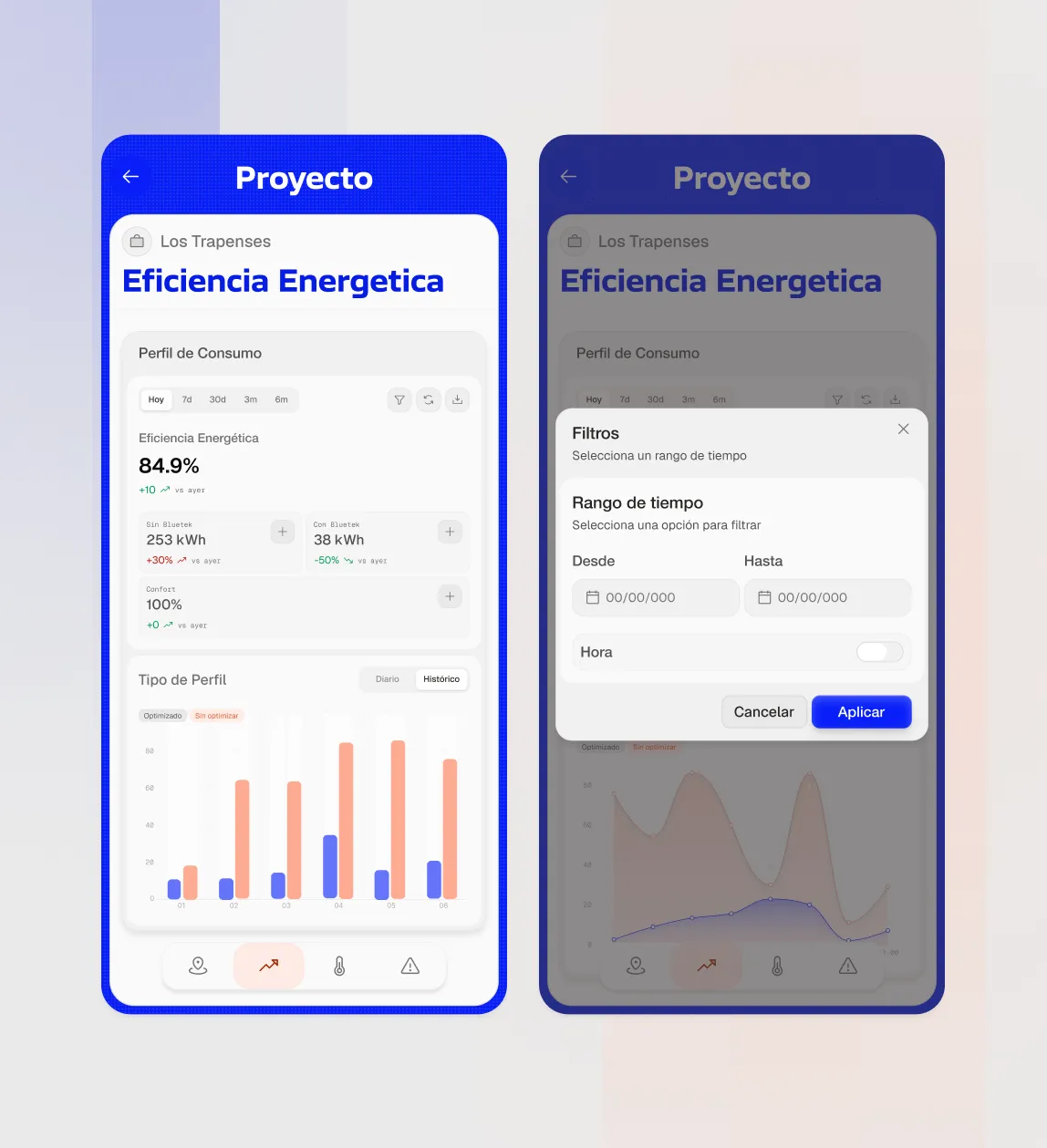
Mobile-first design
Build for field first, scale to desktop after. This meant: tap-friendly controls, metrics that fit one per card, gesture-based navigation, instant feedback. Responsive design is easy. Responsive thinking is harder. Bluetek started in someone's pocket, not on a laptop.
Outcome
The redesigned platform shipped to production in June 2026. Quick wins shipped first: breadcrumbs, sensor naming, language consistency. Structural improvements came after.
But what stuck with me most from this project wasn't the redesign itself. It's that a product can have all the data it needs and say nothing. The difference between data and information is design thinking.
An IoT system doesn't gain value by showing numbers. It gains value when the user understands what's happening now and what to do next. Design was there: converting data into information. Naming sensors. Comparing KPIs. Drawing visible limits on controls. Structuring space.
More project's